Kirjojen hintavertailu – 12 859 828 kirjaa ja 27 kauppaa

Kirjailija

Ronan Bouroullec

Kirjat ja teokset yhdessä paikassa: 10 kirjaa, julkaisuja vuosilta 2012–2025, suosituimpiin kuuluu Inchiostri. Vertaile teosten hintoja ja tarkista saatavuus suomalaisista kirjakaupoista.

10 kirjaa

Kirjojen julkaisuvuodet: 2012–2025.

Inchiostri

Inchiostri

Ronan Bouroullec

Nieves
2025
pokkari
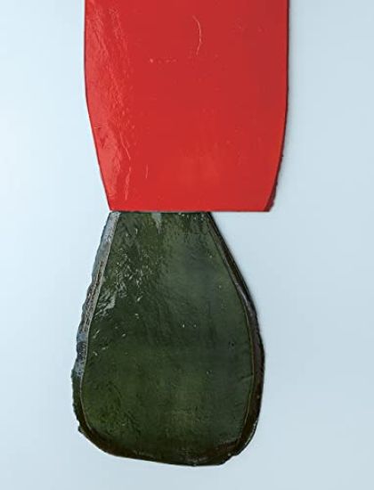
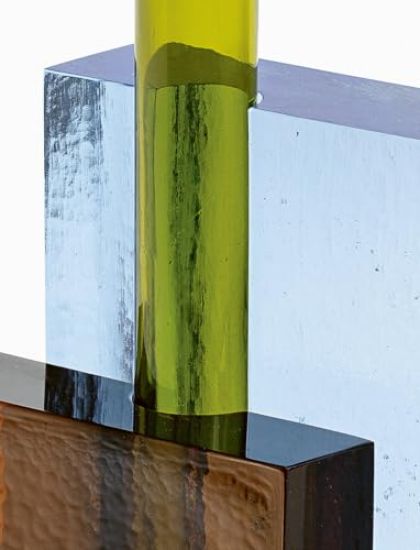
Produced in Murano, in collaboration with the Maestro glassblower Simone Cenedese, each vase is composed of four elements: two blocks of cast glass (in four different sizes and two different thicknesses—6 or 7 centimeters), a blown glass tube (in two different heights), and a small shallow blown glass dish that can be stacked on top of the tube. Each element is of a different shade, picked from an eleven-color palette. From the almost infinite number of possible permutations that these basic forms allow for, Ronan Bouroullec selected twenty unique compositions. Through them, he continues the exploration of themes that are essential to his work. Chiefly, the question of assemblage: in this case, joining things together without fasteners, simply by contact, through an essentially reversible process. Also, the issue of balance: the arrangement of empty space and solid shapes, of cast and blown glass, of fragile objects inserted in sturdy ones. And the notion of paradox: the possibility of elevation being located in the very weight of things, the effect of verticality through horizontality, and luminosity achieved through darkness—as evidenced by the name of the vases, Inchiostri, the Italian word for “inks.”
Lausanne

Lausanne

Ronan Bouroullec

Nieves
2024
pokkari
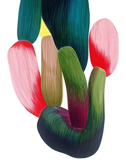
Born in Quimper (Brittany) in 1971, he studied at the École Nationale Supérieure des Arts Appliqués et des Métiers d’Art. In 1996, his Vase Soliflore took its place in the Centre Pompidou’s permanent collection. Giulio Cappellini noticed his work at the Paris Salon du Meuble in 1997, giving him the opportunity to create his first pieces of industrial design, and he was awarded the Grand Prix du Design by the City of Paris. Shortly after, he was joined by his brother Erwan and they began ongoing partnerships with international design brands around the world which are still going today. Ronan Bouroullec set up his Paris-based design studio with his younger brother, Erwan, in ’99. For over two decades, the internationally acclaimed duo have co-created iconic designs for the likes of Vitra, Hay, Flos, Cassina, Ligne Roset, Magis, Mutina Established & Sons and Kvadrat. Their designs are held in some of the world’s most coveted permanent collections, exhibitions have been devoted to their work, and monographs have been published, cataloguing some of their outstanding creations. Alongside their joint recognition, Ronan’s drawings have been featured in many solo exhibitions including Giorgio Mastinu Fine Art (Venice, 2018), Galerie kreo, (Paris, 2019), Licht Gallery (Tokyo, 2021) and Casa Mutina (Milan, 2021-2022) - as well as group exhibitions such as ‘Objects of Desire - Surrealism and Design 1924-Today’, (Vitra Design Museum, Weil am Rhein, Germany, 2019; CaixaForum Barcelona, Spain, 2020; CaixaForum Madrid, Spain, 2020-2021) and ‘Un printemps incertain, invitation à 40 créateurs’, (Museum of Decorative Arts, Paris, 2021). His drawings can be found in a number of major private and international collections, notably the Art Institute of Chicago. Ronan Bouroullec is represented by Galerie kreo, in Paris and London. Whilst the Bouroullecs’ collaborative designs involve a rigorous and complex process of research and testing, Ronan’s personal work offer no interferences, no plans. Drawing – which has been a regular activity since early childhood – occupies an important place in his daily life. Today, his drawings are instinctive and exude freedom.
Ronan Bouroullec

Ronan Bouroullec

Ronan Bouroullec

PHAIDON PRESS LTD
2023
sidottu

Halvin toimitettuna 35,80 €

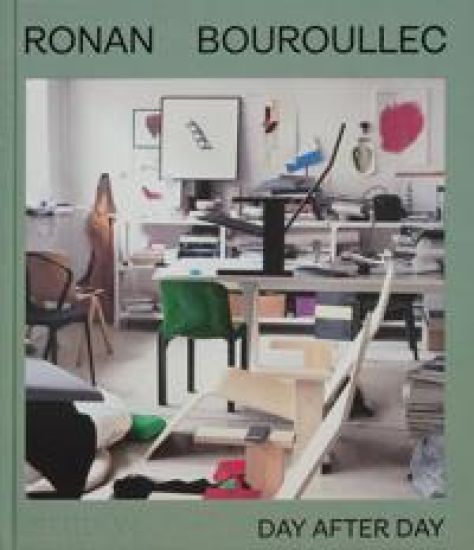
‘Each spread is a mosaic of people, places, products and artworks from a singular point of view.’ – New York Times A stunning and inspiring visual inventory from one the most creative and popular designers working today French designer Ronan Bouroullec works at the very forefront of design. Over his 30-year career he has used photography to document his process and communicate his unique perspective, amassing a vast archive of images in the process. He shares these images on Instagram, where he has a huge and loyal following. Thousands of images from the archive have been chronologically sequenced to illustrate his work and life in a fresh, new way. Part visual diary, part catalog of his work, and with captions in both English and French, Ronan Bouroullec: Day After Day presents these images to a wider readership and offers an intimate and fascinating look into his life, vision, and creative process, offering a unique and vibrant insight into the work, perspective, and creative process of one of the most celebrated and creative design minds working today
Fièvre

Fièvre

Ronan Bouroullec

Nieves
2023
pokkari
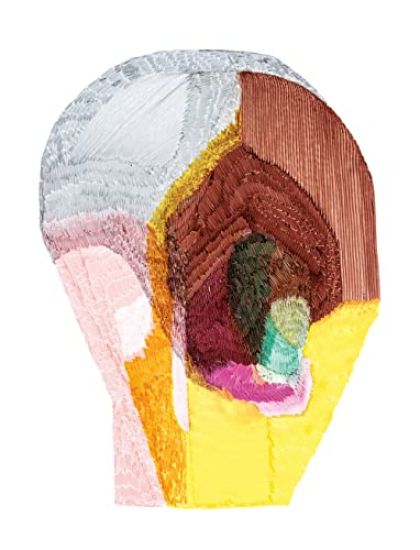
Ronan Bouroullec has always drawn daily. A pure artistic practice that he considers autonomous from the profession for which he is internationally recognized. But if there is a porosity between these two sides of his activity which feed each other, Ronan Bouroullec considers drawing as essential to his balance. Fièvre coincides with the exhibition Dessins Quotidiens at l’Hôtel des Arts in Toulon, France. With nearly 300 works (drawings, bas-reliefs and notebooks) presented in the exhibition, he reveals a small part, still little known, of his creative talent. A tiny part compared to the thousands of drawings he all keeps, but rich enough to illuminate this very intimate facet of the personality of one of the most talented French designers of his generation. Ronan Bouroullec (born 1971) and Erwan Bouroullec (born 1976) have been working together for more than twenty years now. Their collaboration is a permanent dialogue nourished by their distinct personalities and a shared notion of diligence with the intention to reach more balance and fineness. Their work has covered many fields ranging from the design of small objects as jewellery to spatial arrangements and architecture, from craftsmanship to industrial scale, from drawings to videos and photography. They have collaborated with leading companies such as Vitra, Cappellini, Issey Miyake, Magis, Ligne Roset, Habitat and Kréo Gallery. Ronan and Erwan Bouroullec’s designs are part of the permanent museum collections of the Museum of Modern Art in New York, Centre Pompidou in Paris, the London Design Museum, the Lisbon Design Museum and the Boijmans van Beuningen Museum of Rotterdam.
Bas-Reliefs

Bas-Reliefs

Ronan Bouroullec

Nieves
2022
nidottu
We could look at Ronan Bouroullec’s ceramic bas-reliefs and see traces of a language we recognize: the silhouettes of familiar objects, the contours of known landscapes. We might be tempted to look at the work as an alphabet of mere things, think of the pieces “objectively. ” But as tableaux, the reliefs are not quite right: one has an edge that goes too far, another a circle that’s off-center and about to roll, and still another, a pinkish mass that could topple over. Bouroullec’s work is most rewarding if we listen as it asks for a new language altogether. Languages have always been born from clay (one thinks of cuneiform seals); it’s easy to believe that Bouroullec is developing his own. At the very least, these pieces – somewhere at the intersection between painting, sculpture, and design – demand new verbs, words like “bevel” and “disintegrate. ” (And it’s possible, the works say, that there is nothing so lovely as a beveled edge: the way they taper is like a caress. The way they dissolve onto a background feels digital and also deeply analogue. These effects are both visual and tactile, as in: we see them and we want to touch them. ) The compositions can speak because they are alive, masses of ceramic breathing in a metal atmosphere, on a planet that is strange but inviting. Like other languages, Bouroullec’s seems to have a grammar. Forms repeat and the palette is consistent, like a dialect. Where there are slight variations, the works prove the rule. Some compositions get repeated and flipped upside down. Bouroullec’s process is also inherently syntactical: while the finished works have the appearance of precise composition, they’re arranged ex post facto from separately formed elements. Bouroullec assembles the reliefs only after the individual elements are fired; some inevitably break in the kiln. Like sentences, Bouroullec’s compositions are sequences of fixed parts. Like poetry, they’re subject to randomness. In a photo from Bouroullec’s studio, he leans over a makeshift table on which he’s rolled out a thick slab of clay. It’s dark; he’s holding a kitchen knife – later it will be caked with residue from the material he’s using it to carve. To his left is a pile of thin scraps that have been trimmed from the larger whole; the ceramic retains a feeling of paperiness in the finished works. This has something to do with figure and ground, the glazed ceramic forms (marked with cracks, bubbles, and the traces of tools) buoyed by contrast with the flatness and sharpness of the synthetic surface on which they’ve been arranged. The sense of découpage – careful composition with paper cutouts – goes deeper than the formal similarity with Bouroullec’s earlier drawings and design. Bouroullec has other precursors. Artists longing for new alphabets in abstraction, or those preoccupied with simple forms and chance operations. At its core, though, this work seems to carry out an older project – the Suprematist project of Kazimir Malevich. In Malevich’s manifesto on Suprematism, Malevich writes of “a ‘desert,’ where nothing is real except feeling. ” Malevich believed that he had discovered the grammar of this non-objective world. Bouroullec has re-discovered it – and renewed it for our time. This is why the works seem to have a primal resonance. They short circuit our hard-wired symbolic understanding, whisper of other landscapes. They remind us that mass and atmosphere are forms of pleasure, and ask us to be pleased. Josh Ascherman
Pucci de Rossi

Pucci de Rossi

Nancy Huston; Jean-Louis Gaillemin; Laure Verniere; Ronan Bouroullec

Norma,Editions
2017
sidottu
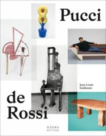
An artist-designer who defies classification, Pucci de Rossi (1947-2013) was a pillar of the European art scene in the 1980s. Originally from Verona, and trained by the American sculptor H. B. Walker, Pucci de Rossi created his first pieces by assembling wooden furniture to make some rather odd-looking and unstable forms, somewhere between thrones and time machines. "My profession was a game to me," he once remarked. "I was cutting, I was making, I was inventing." His first designs, steeped in poetry and humour, recalled the minimalism of Arte Povera as much as Studio Memphis' neobaroque. Jewellery, furniture, sculpture, painting: Pucci's universe knew no limits except those of his own imagination. In his hands, even the most modest materials transcended themselves to become works of great visual and functional power. This was soon recognised; after 1985 he regularly exhibited in Paris, and in New York at the gallery Neotu, founded by Pierre Staudenmeyer. Some of his most notable accomplishments involve designing the layout for the Barbara Bui boutique in Paris, and the palace of the auctioneer Jean-Claude Binoche in Venice. In the 1990s his work was on display at the Downtown Gallery, and in 1994-1995 he collaborated with the CIRVA in Marseille. Shortly prior to his death, Jacques-Antoine Granjon, one of his most faithful collectors, commissioned a sketch for the frontage of the VentePrivee.com building in La Plaine-Saint-Denis. Baptized 'Verona', the metallic skin covering the facade, which was inspired by that drawing, pays tribute to him today. Pucci de Rossi created more than 900 pieces during his lifetime; this book gives him the commemoration he deserves.
Sgrafo vs. Lava

Sgrafo vs. Lava

Ronan Bouroullec; Horst Makus; Nicolas Trembley

JRP Ringier
2012
nidottu
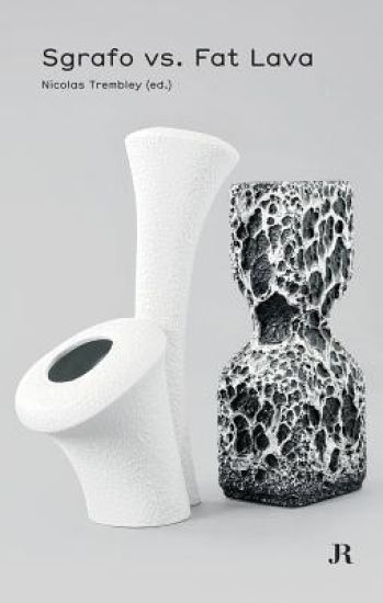
From Raymond Loewy's austere "Form 2000" teapot set of the mid-1950s to the Sgrafo vases of the 1960s and the improbable "Fat Lava" glacis of the 1970s, postwar German ceramics exhibited a tremendous stylistic diversity, mixing references to Op art, geometric abstraction, the funky, angular designs of Werner Panton and the biomorphism of hippie aesthetics. Both famed and anonymous designers translated the various aspirations of a postwar Germany under reconstruction into exaggerated, semi-futuristic shapes, as well as pursuing cooler, more stripped down effects. Sgrafo vs. Fat Lava explores this fertile tension in German ceramics, with reproductions of relevant works, an essay by the ceramics specialist Horst Markus and an interview with designer Ronan Bouroullec.